Watch the Top Row
 Everyone, all together now, “YAY!!!!!”
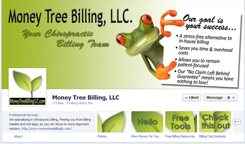
That is exactly how we feel about the new “top row” in the Facebook Timeline for Pages. This could possibly be the coolest part of the new layout. Where before the About area, Apps and custom pages were a mere list of links below the profile image (which tended to blend in and not really catch any attention), now they are a main feature of your Facebook business page presence. And that’s not even the best part; you can now customize the thumbnail images for each of your apps/pages!
A common theme has been in place with Timeline for Pages. Not only are changes extremely visual, they also bring a change in strategy as well; the same goes for the new top row.
First you’ll notice About. This area will feature different information depending on what category you’ve selected for your page. A local business for example will show an address, phone number, etc., while a company specializing in business services will show what you have in the About field of your page’s info page, which is much more customizable. We’ve seen brands including website URLs, calls to actions, even arrows (—->) to draw attention to the “top row” and other page features.
Next we have what Facebook now refers to as Apps (formerly these were the links that appeared below your page’s profile image in the old page design). App images are arranged in rows of 4, with 12 spaces total. By default your fans only see the top 4 “above the fold” (see the rest by selecting the down arrow on the right to expand the view). You can rearrange your page’s Apps to appear in whatever order you like, with the exception of the Photos, which always appears in the first position. To rearrange your Apps, click the Edit button on the App and select from the list the App you’d like to switch it with. Tip: The App image that shows the Likes on your page actually links to your Insights, giving anyone and everyone a modified look at your page’s stats. For big brands who like to show off, this is great. The small to mid-sized businesses we’ve talked to don’t really like the idea. We suggest you simply bury that App by moving it to the last position so it’s not visible (You’ll need to have three other Apps to fill the top row).
As we already mentioned, you can create custom images for each of your Apps (except for Photos, which by default shows the most recent photo upload to your page). The ideal size for App thumbnails is 111 pixels by 74 pixels. And what do you use as your image? Well, that’s where the strategy comes in.
Many of us were disappointed by the strict rules surrounding business page Cover images, especially the one against the “call to action”. App images have no such restrictions; feel free to “call to act” to your heart’s content. A custom page strategy can be particularly effective; add a page for promoting an upcoming webinar, class, or event and use the App image as a teaser. A page with your e-newsletter opt-in might include an image of your pink spoon in your App image.
Creativity definitely wins out in the “top row”. You’ll want to put at least as much time strategizing on the layout of your “top row” as you did in the look of your cover image, if not more. Your goal: to leverage all the new customization options available and catch the attention of your page visitors to really get noticed!


